Covid19 Cases: Victoria vs. US States - an update
Data: Johns Hopkins University - Covid-19 Data
You can access the data here: Link. The key feature of this data is the fact that it reports the case and death numbers for Australia and US at the state level.
You can visit our Covid-World App here and our Covid-Australia App here.
Before I start…
Comparing Covid-19 numbers across different jurisdications comes with major caveats. The way that cases and deaths are defined or counted, the testing patterns, and many other factors contribute to potential inconsistencies. However, despite all these issues, there are still learnings when this is done taking into account all those factors. Moreover, I have not made any conclusions in this post, I have only presented the available data.
To view the plots in higher quality, right click and open them in a new page or tab.
Death Trends
To see the plots for the trends of number of deaths, please see here
Victoria vs. US states
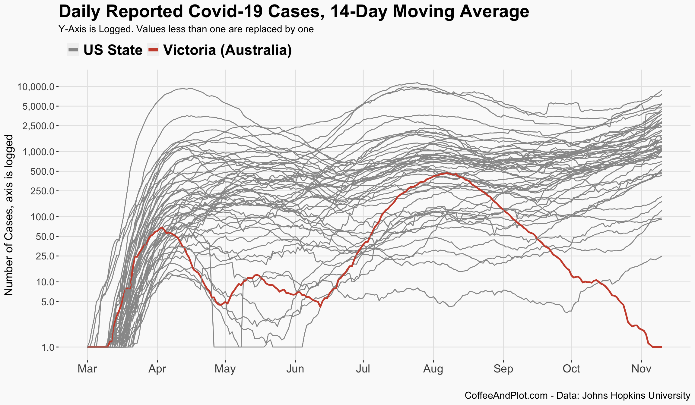
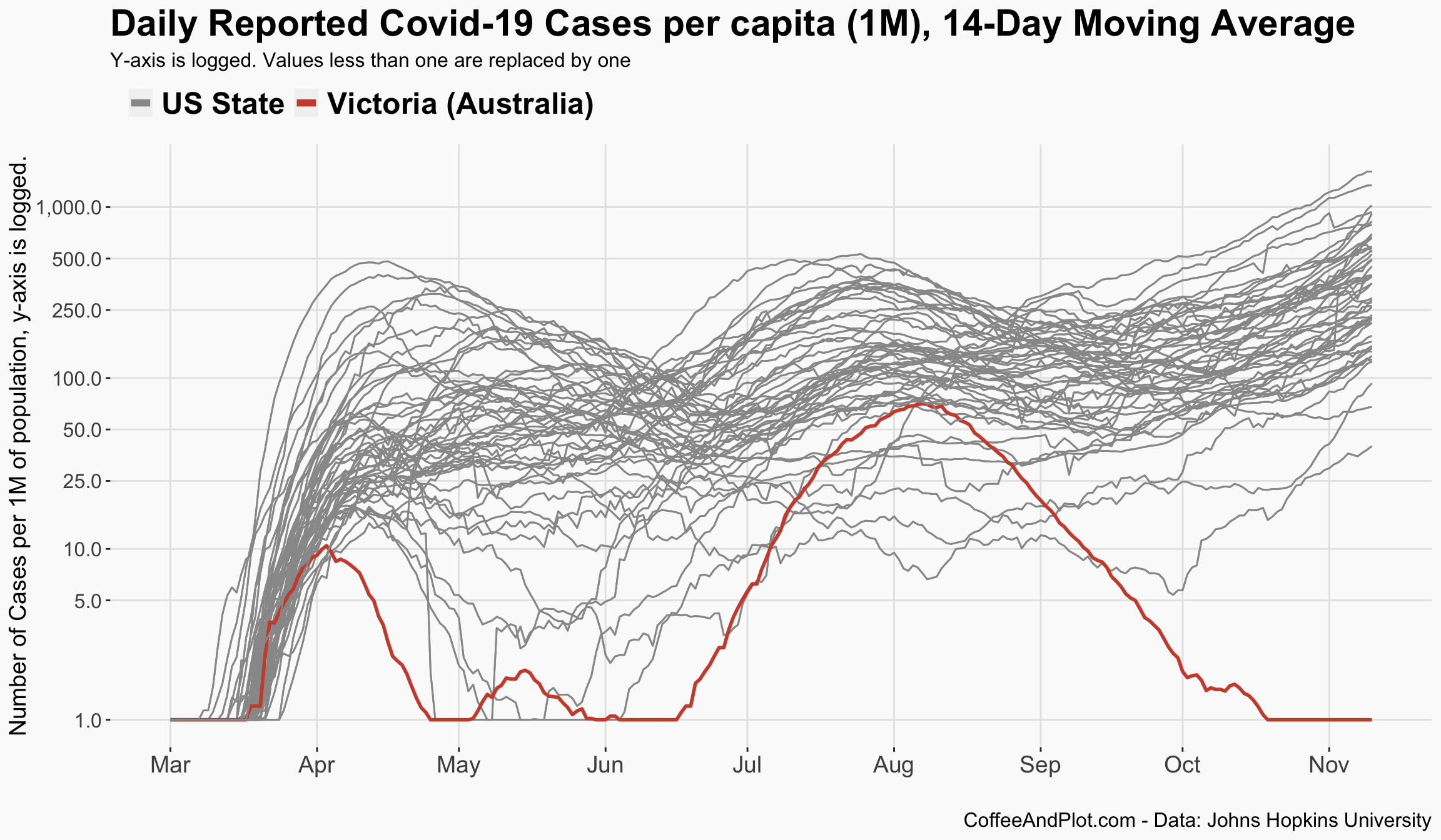
Let’s start with an overall picture. In the first plot, you can see Victoria along with all US states since the start of the pandemic. Please notice that the y-axis on this plot is logged so it better presents the dynamics of these trends. As the plot shows, the first wave in Victoria started with an ascending pattern similar to many US states, however, Victoria did not experience a widespread community transmission back in March and April. However, that changed in June which is now refered to as the second wave in Victoria.
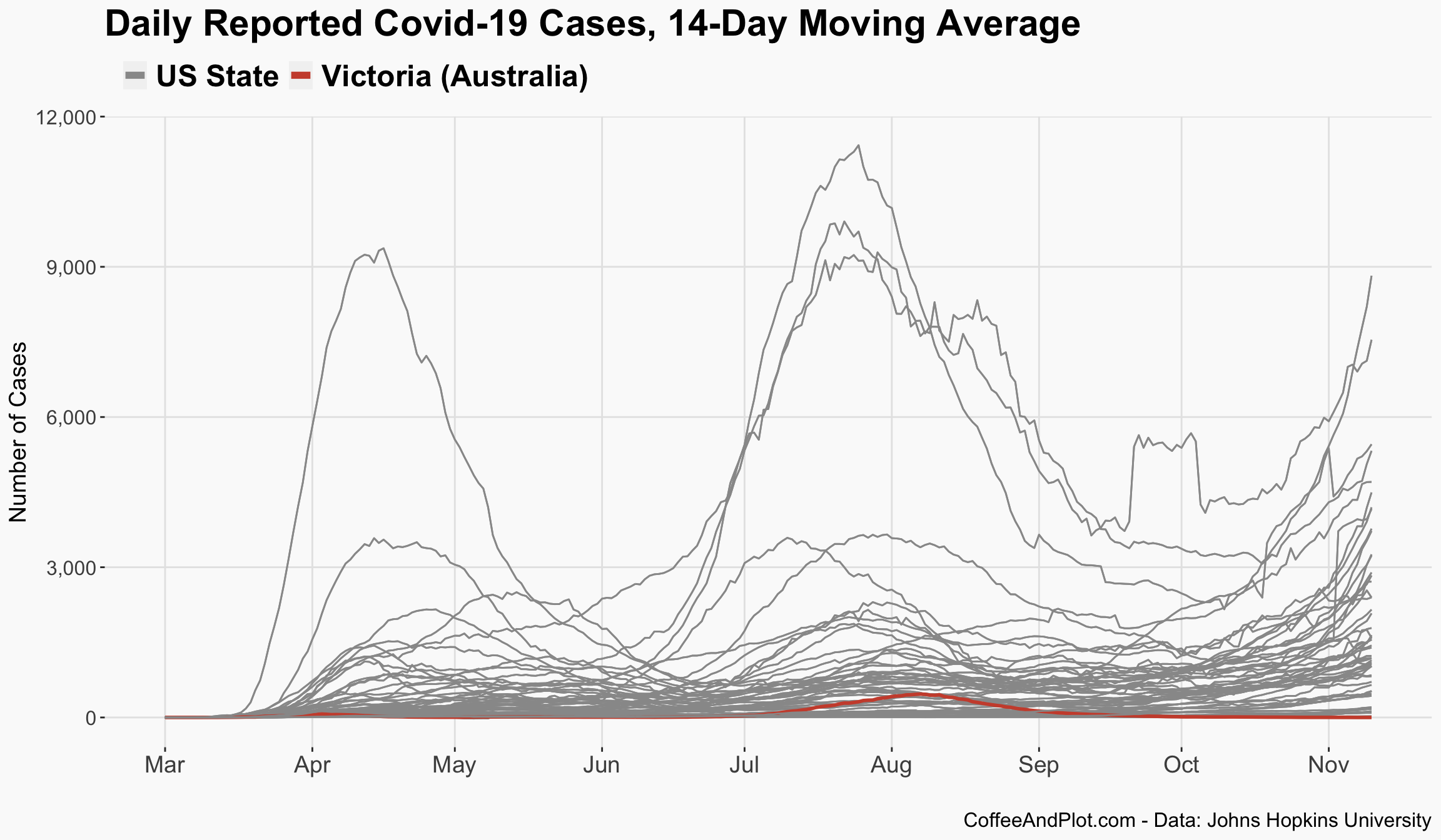
Now, let us have another look at this plot but this time with a linear y-axis. As you can see, even at its peak, the second wave in Victoria now looks small compared to what has been happening across some states in the US.
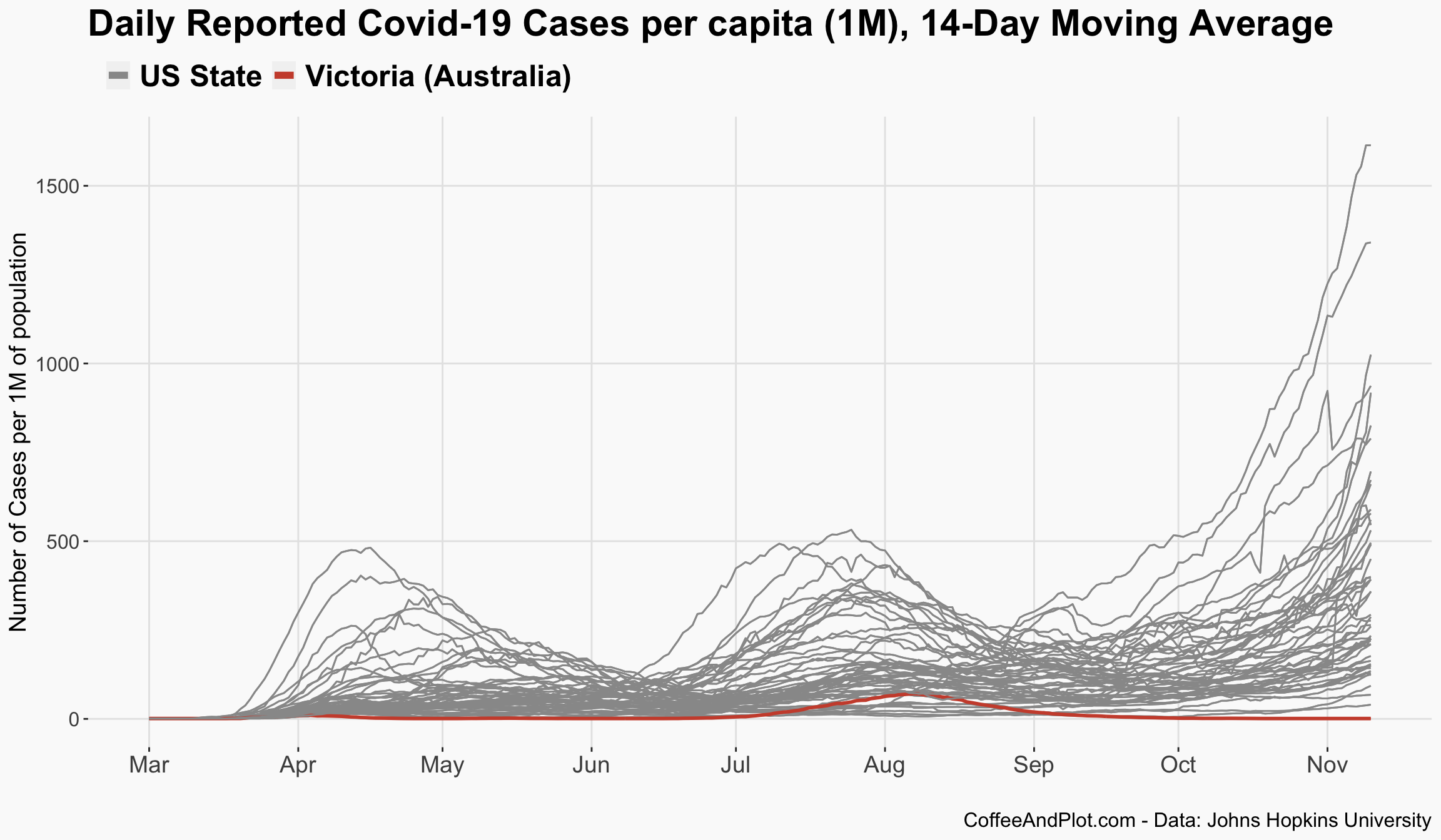
I understand that the population size across these states is very different, so here is the previous plot, corrected for the population. This plot shows confirmed cases per 1 million of population. The trend is more visible but still not vey useful when it comes to comparison since it is hard to find states in the US that may have had similar patterns.
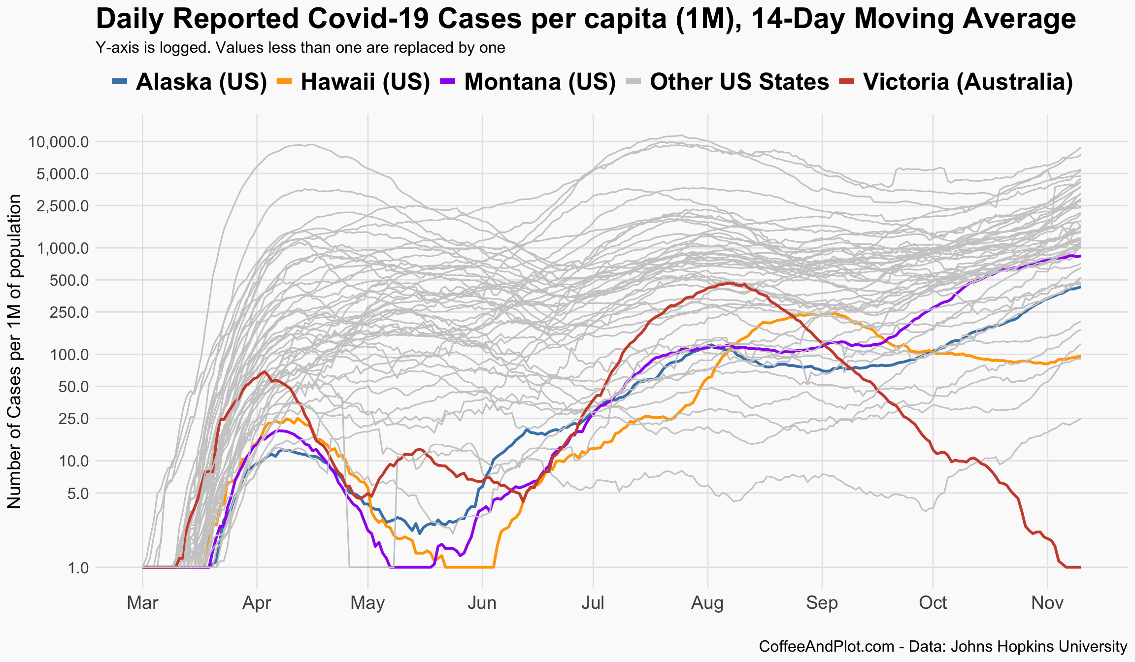
So, if I use a logged y-axis on the previous plot, which is corrected for population, you would see this. If you look closely, there seem to be a few states in the US that have similar pattern to Victoria, in terms of having two waves, a smaller first one and a second larger one. Let’s highlight them.
Those states are now more visible. Please notice that the plot is per capita (1M of population) and has a logged y-axis.
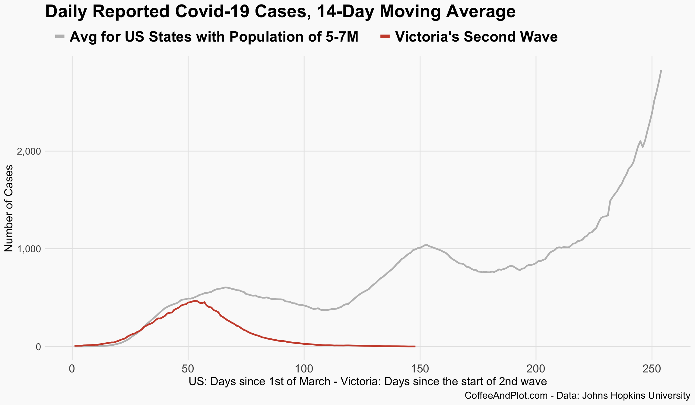
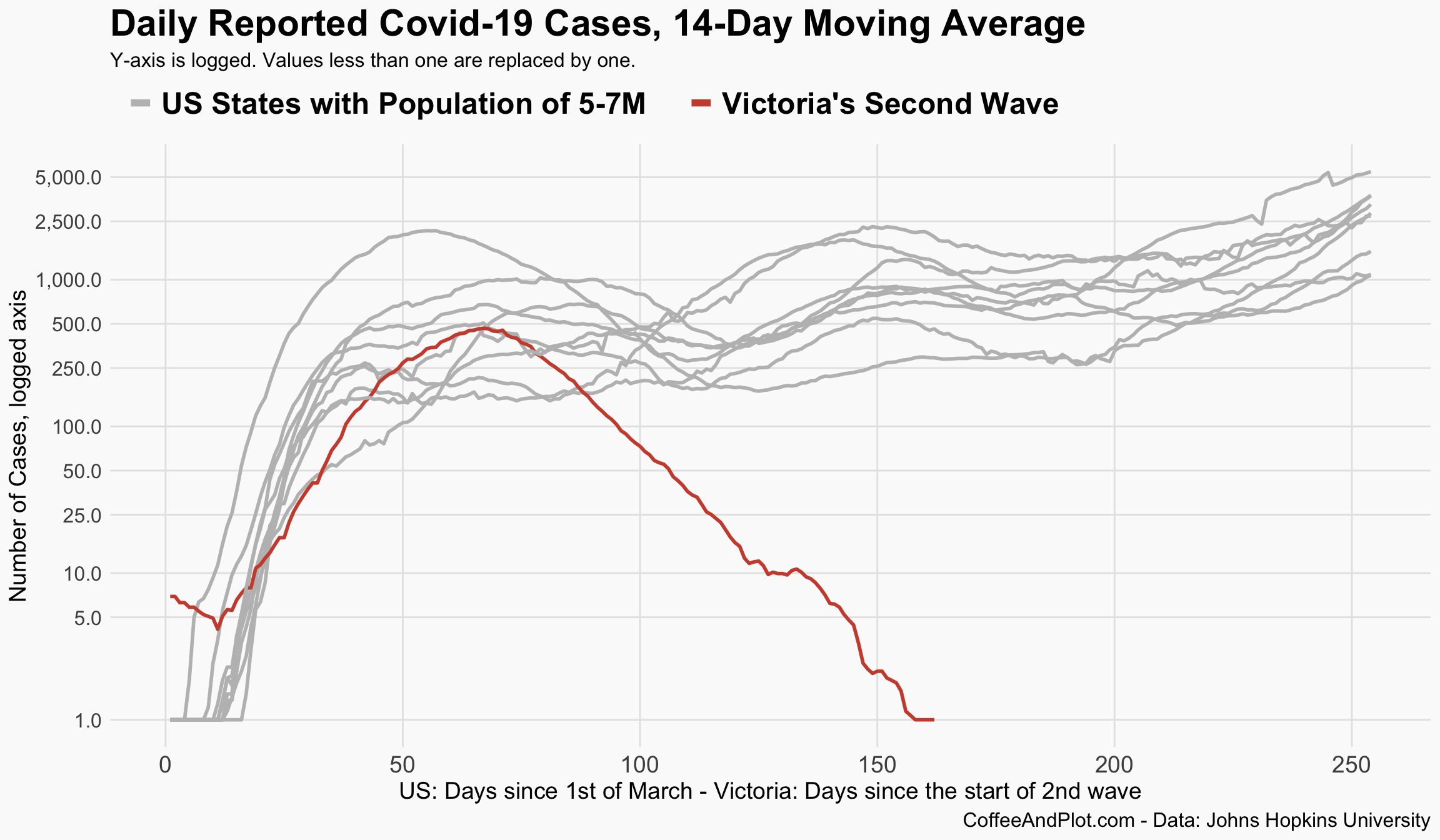
Ok, let’s look at this from a different perspective. Rather than using the per capita measure, here I have only included the states that have a population between five to seven million. They are: Colorado, Indiana, Maryland, Massachusetts, Minnesota, Missouri, South Carolina, Tennessee, and Wisconsin, and of course Victoria in Australia. I have moved Victoria’s trend by 92 days for this plot.
The plot clearly shows the different trajectory that Victoria has taken in managing its second wave.
Now, let’s simplify this figure so we can compare the trends a bit better. For the next plot, I have calculated the average number of new cases for those selected states in the US and have plotted that along with Victoria.