Queensland Election 2020: Some analysis of the vote swing - Part 1
Data: Well, Wikipedia!
I know, but I could not find a better source where I can easily scrape the data.
So, I used the data from this page for 2020 and this page for 2017.
Findings
On the first figure, the x-axis is the share of vote in 2017 and the y-axis is the share of votes in 2020. Each dot represents a seat and colors separate the parties.
A few things to explain:
- You can see a range of orange dots where 2017 vote share is zero but 2020 vote share is greater than zero. Those are the seats where One Nation (ONP) did not have a candidate in 2017 but they had in 2020 and so their vote share moved from zero to a number larger than zero.
- The dashed line has an intercept of zero and slope of one. So, if a Party-Seat dot is above the line, it means that their 2020 share of votes was higher than 2017 and if they are below the line, it was lower.
What is visible in the plot?
- Almost at any seat that ONP had a candidate back in 2017, the 2020 share is lower than 2017.
- In seats that ONP introduced a candidate in 2020, the share of votes did not go above 15% which is much lower than the share of votes for majority of their candidates in 2017.
- Greens have more dots below the line but the gap between the two elections is not as wide as the ONP.
- The LNP and Labor have more points above the line which indicates a swing toward them but Labor seem to have fewer left under the line. In other words, it seems that there was a swing toward Labor across more seats than for the LNP.
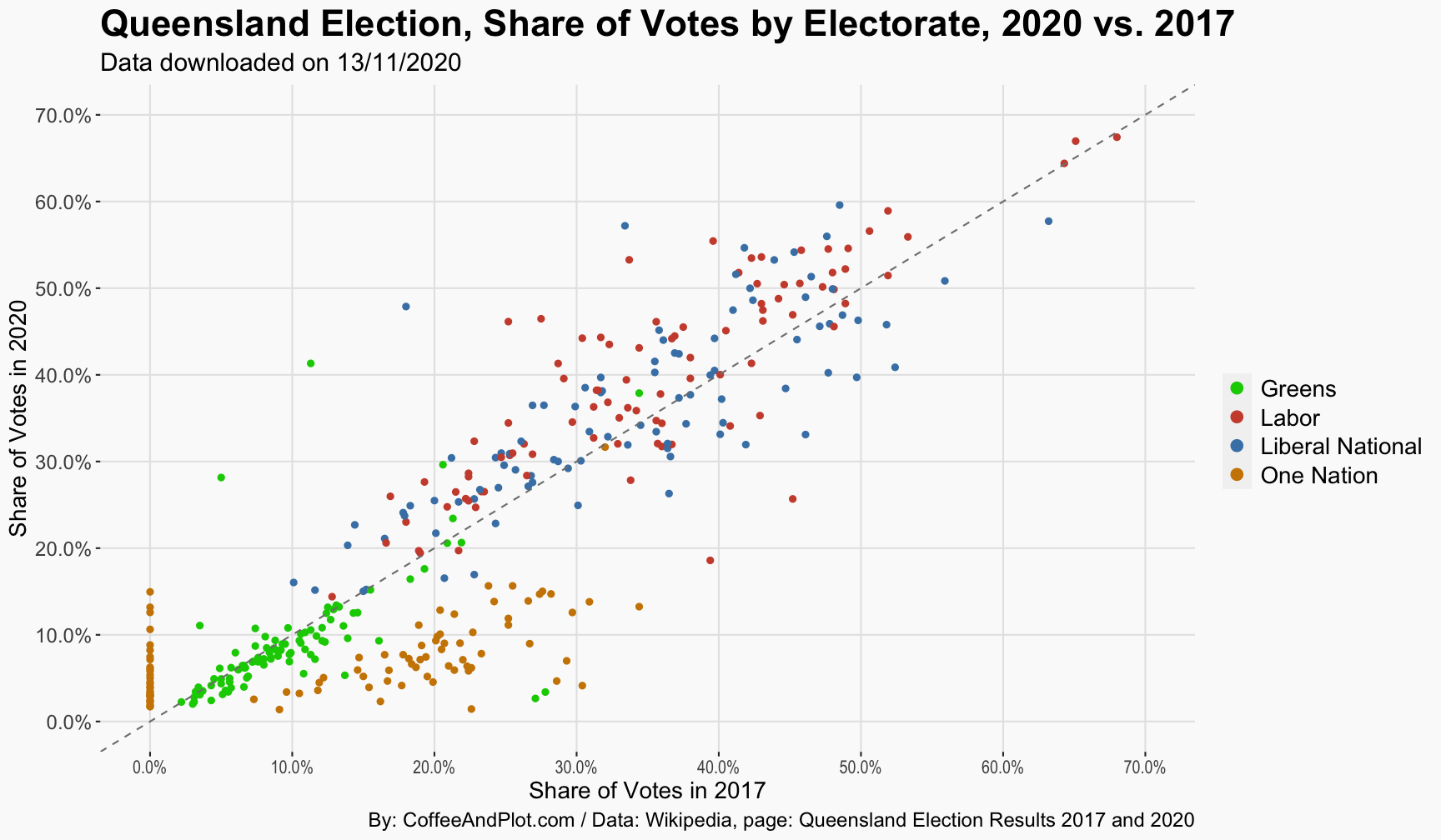
If you would like to play with the data, here is an interactive chart where you can select the parties that you would like to be included.
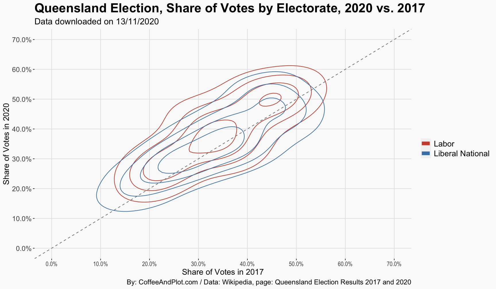
Let me give you a cooler version of this plot and let’s only focus on the Labor and LNP. Here, I am showing how these dots are distributed using a density plot so you can better see the small difference between the two parties in terms of how the votes shifted in 2020 compared to 2017. As I mentioned before, you can see that the Labor’s share of votes has shifted upward slightly higher than where LNP is positioned.
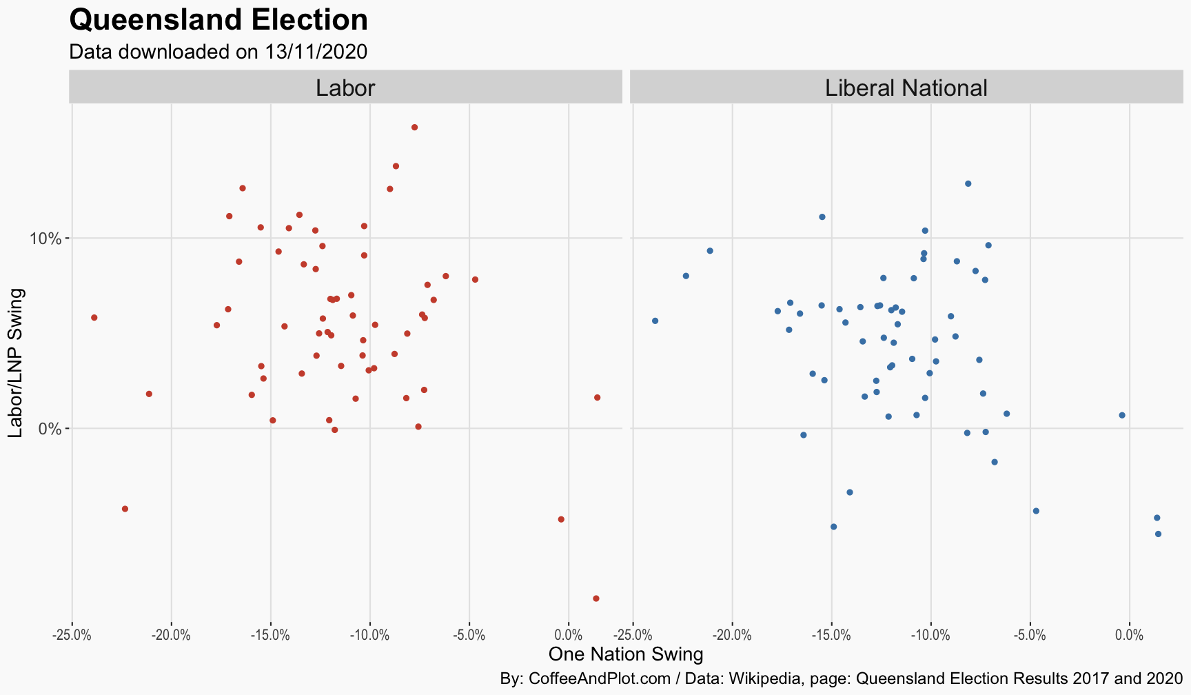
Now, one big question in this election was about the swing against the One Nation and how that vote was re-distributed between the Labor and LNP. In the next plot, I am trying to explore whether there is a correlation between swing against the ONP (x-axis) and swing toward the Labor or LNP (y-axis).
As the figure shows, there seems to be a weak relationship there and it looks slightly stronger for the LNP.
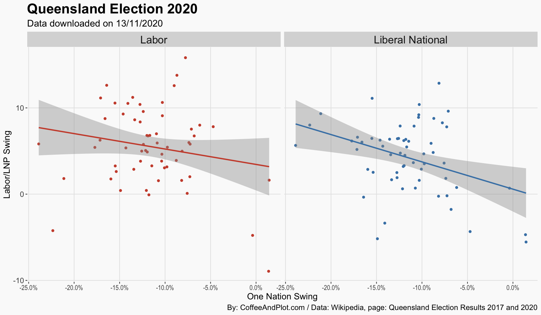
I don’t like fitting a line when the relationship is not strong but since it helps some people to get a better sense of the relationship, here it is the dots along with a line. I think the line and the relationship between the Labor and ONP is mainly driven by a few outliers.
Now, the question is: without access to the individual votes, how can we get a sense of how voting patterns shifted in QLD? For example, did the vote move from the ONP to Labor or did the vote shift from ONP to LNP and then from LNP to Labor.
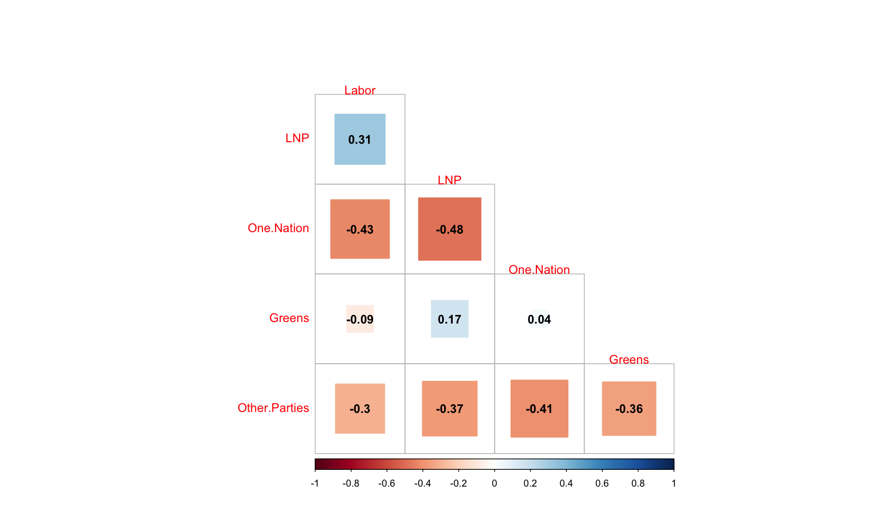
Let me start by a simple correlation plot. Here, I have correlated each party’s vote swing against the other parties at each seat. The largest number is the negative correlation between the One Nation and the LNP, showing that where there has been a swing against the ONP, LNP has gained votes.
The challenge with the correlation plot is that, well, it does not tell you much beyond whether the data moved in the same direction or not. So, as the next step, I have three regressions in one table. The first one on the left models the swing in votes for the Labor Party against the swing for One Nation, Greens, and the LNP. The one on the middle shows a regression where this time the LNP’s swing it the outcome and finally the model on the right has One Nation swing as the outcome. Basically, the idea here is to find out, if you control for the swing in other parties, how much relationship will be left between the swing for each pair of parties.
I have controlled for a couple of other variables in the analysis but here I have only shown the coefficients for the party vote swing variables. I have removed all the seats where the ONP did not have a candidate there in the last election to have a more realistic view of the swing toward or against them.
So, what does this table show?
1- Labor vote swing is not associated with the swing in other parties. That does not mean that there was no relationship but mainly shows that it was not strong enough to show up here, you know, statistically strong enough. I think it also shows that the swing toward Labor was not necessarily driven by swing away from a specific party but
2- The statistically significant relationship, is a negative relationship between the LNP and the One Nation. In other words, where there has been a negative swing against the One Nation, there was likely a swing toward the LNP.
I have a few more plots and regressions on the vote swing in QLD that will share soon here.
| Labor.Swing2020 | LNP.Swing2020 | ONP.Swing.2020 | ||||
|---|---|---|---|---|---|---|
| Predictors | Estimates | CI | Estimates | CI | Estimates | CI |
| LNP.Swing.2020 | 0.2 | -0.1 – 0.5 | -0.4 ** | -0.7 – -0.1 | ||
| One.Nation.Swing.2020 | -0.1 | -0.4 – 0.1 | -0.3 * | -0.5 – -0.0 | ||
| Greens.Swing.2020 | -0.2 | -0.7 – 0.3 | 0.1 | -0.4 – 0.5 | 0.6 * | 0.0 – 1.1 |
| Labor.Swing.2020 | 0.2 | -0.1 – 0.4 | -0.1 | -0.3 – 0.2 | ||
| Observations | 60 | 60 | 60 | |||
| R2 / R2 adjusted | 0.248 / 0.193 | 0.249 / 0.195 | 0.220 / 0.163 | |||
|
||||||